Statistics gone wild, girls gone average
Simpson's Paradox
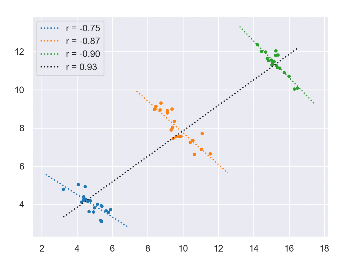
Correlations between variables for samples of a population can have an opposite correlation coefficient compared to the whole population.This was first discussed in the seventies when Stanford admissions were reviewed for gender bias.
Below is an extreme illustration of such an effect, the overall correlation shows a positive coefficient while individual classes show a clearly negative correlation coefficient.

Simpson’s Paradox from J.Pearl
When an event \(C\) increases the probability of \(E\) in a given population \(p\) and, at the same time, decreases the probability of \(E\) in every subpopulation of \(p\). For complementary properties \(F\) and \(\neg F\) of two subpopulations, we may encounter the inequalities: \[\begin{align} P(E|C) > P(E | \neg C) \\\\ P(E|C,F) < P(E | \neg C, F) \\\\ P(E|C, \neg F) < P(E | \neg C, \neg F)\\\\ \end{align}\]
Here is an example where \(F\) and \(\neg F\) are the gender of individuals, \(C\) and \(\neg C\) the test and control groups and \(E\) the recovery.
| Combined | \(E\) | \(\neg E\) | Recovery Rate | |
|---|---|---|---|---|
| Drug (\(C\)) | 20 | 20 | 40 | 50% |
| No drug (\(\neg C\)) | 16 | 24 | 40 | 40% |
| 36 | 44 | 80 |
| Males | \(E\) | \(\neg E\) | Recovery Rate | |
|---|---|---|---|---|
| Drug (\(C\)) | 18 | 12 | 30 | 60% |
| No drug (\(\neg C\)) | 7 | 3 | 10 | 70% |
| 25 | 15 | 40 |
| Females | \(E\) | \(\neg E\) | Recovery Rate | |
|---|---|---|---|---|
| Drug (\(C\)) | 2 | 8 | 10 | 20% |
| No drug (\(\neg C\)) | 9 | 21 | 30 | 30% |
| 11 | 29 | 40 |
In this case the main factor of recovery is the gender, so a disproportion of males in the combined sample leaves the impression that the drug is benefecial while it is really harmful.
Code
Below is the Python code used to generate the picture above.
import seaborn as sns
import numpy as np
import matplotlib.pyplot as plt
from matplotlib.colors import TABLEAU_COLORS

m = np.array([5, 10, 15])
sx = np.array([.7, .8, .7])
sy = np.array([.4, .5, .3])
c = np.array([-.7, -.8, -.9])
ns = 20

C = .77
X = np.zeros((3, ns))
Y = np.zeros_like(X)

for i in np.arange(3):
    x = np.random.randn(ns) * sx[i]
    y = x * c[i] + np.random.randn(ns) * sy[i]

    X[i, :] = x + m[i]
    Y[i, :] = y + m[i] * C


sns.set_theme()
plt.figure()
for i in np.arange(3):
    col = list(TABLEAU_COLORS.values())[i]
    xscale = np.linspace(np.min(X[i, :]) -1, np.max(X[i, :]) +1, 2)
    pol = np.polyfit(X[i, :], Y[i, :], deg=1)
    rc = np.corrcoef(X[i, :], Y[i, :])[1, 0]
    label = f"r = {rc:0.2f}"

    plt.plot(X[i, :], Y[i, :], '.', color=col)
    plt.plot(xscale, pol[0] * xscale + pol[1], ':', color=col, label=label)


xscale = np.linspace(np.min(X), np.max(X), 2)
pol = np.polyfit(X.flatten(), Y.flatten(), deg=1)
rc = np.corrcoef(X.flatten(), Y.flatten())[1, 0]
label = f"r = {rc:0.2f}"
plt.plot(xscale, pol[0] * xscale + pol[1], ':k', label=label)
plt.legend()
References and Further Reading
J. Pearl. Causality: Models, Reasoning and Inference. Second Edition.
Olivier STATS
